
This post takes as its starting point the higher education destination data published by the Department for Education (DfE) in June 2014.
 It explores:
- The gaps between progression rates for students from disadvantaged backgrounds (defined in terms of eligibility for free school meals) and those of their more advantaged peers.
- How these rates vary according to whether the students come from schools or colleges and the selectivity of the higher education to which they progress.
- Regional differences, with a particular focus on Inner and Outer London.
Although these are officially classified as experimental statistics, they supply a valuable alternative perspective on national progress towards fair access for disadvantaged learners to selective universities.
Securing such progress is integral to the Government’s education and social mobility strategy, since it is embedded in DfE’s Impact Indicators, in BIS Performance Indicators and the Social Mobility Indicators. The DfE indicators depend on these destination measures.
The final section discusses the optimal policy response to the position revealed by this analysis. It:
- Discusses the limitations of a free market solution combined with institutional autonomy, structural reform – especially the introduction of specialist post-16 providers – and the expected incorporation of these measures into the post-16 accountability framework.
- Sets out the advantages of introducing a framework to support the market on both the demand and supply sides. This would secure a coherent and consistent menu of opportunities that might be targeted directly at the learners most likely to benefit. This might be undertaken at national or at regional level, including in London.
- Suggests that – given the abundant evidence of stalled progress – the latter approach is most likely to bring about more immediate, significant and sustained improvement without excessive deadweight cost.
I am publishing this on the eve of The Brilliant Club’s Inaugural Conference, which asks the question
‘How can universities and schools help pupils from low participation backgrounds secure places and succeed at highly competitive universities?’
The organisers and participants are cordially invited to admit this second personal contribution to this debate, for I have already written extensively about the particular problem of fair access to Oxbridge for disadvantaged learners.
That post exposed some rather shaky statistical interpretation by the universities concerned and proposed a series of policy steps to address the worryingly low progression rates to these two universities. I will refer to it occasionally below, keeping repetition to a minimum. I commend it to you as a companion piece to this.
The Destination Data
DfE published SFR 19/2014: ‘Destinations of key stage 4 and key stage 5 pupils: 2011 to 2012’ on 26 June 2014.
These are described as ‘experimental statistics…as data are still being evaluated and remain subject to further testing in terms of their reliability and ability to meet customer needs’.
Nevertheless, subject to possible further refinement, DfE plans to incorporate KS5 destination measures into the new post-16 accountability arrangements to be introduced from 2016. They are set to become increasingly significant for school sixth forms and post-16 providers alike.
The measures are based on student activity in the year immediately following the completion of A level or other Level 3 qualifications.
Students are included if:
- They are aged 16, 17 or 18 and entered for at least one A level or other L3 qualification. (Those entered for AS level only are therefore excluded.)
- They ‘show sustained participation…in all of the first two terms of the year after…’ ie from October 2011 to March 2012. (Dropouts are excluded but there is provision to pick up students transferring from one provider to another.)
The time lag is caused by the need to match data from the national pupil database (NPD) and the Higher Education Statistics Agency (HESA). The most recent matchable dataset combines the HESA data for academic year 2011/12 with the KS5 performance data for academic year 2010/11.
The 2011/12 destination data includes partial coverage of independent schools for the first time, alongside state-funded schools and colleges, but my analysis is confined to state-funded institutions.
The measure of disadvantage is eligibility for free school meals (FSM). Students are considered disadvantaged if they were eligible for and receiving FSM meals at any point in Year 11, so immediately prior to KS5. This post typically uses ‘FSM’ or ‘FSM-eligible’ to describe this group.
FSM is a narrower definition of disadvantage than the Pupil Premium, which is based on FSM eligibility at any point in the preceding six years. These two definitions continue to have most currency in the schools sector, but are frequently disregarded in the higher education sector where several alternatives are deployed.
All measures of disadvantage have upside and downside and, having explored this issue extensively in my previous post about Oxbridge, I do not propose to cover the same ground here.
I will only repeat the contention that, far too often, those facing criticism for their failure to improve fair access will criticise in turn the measures adopted, so producing a smokescreen to deflect attention from that failure.
The analysis that follows draws principally on tables included in the underlying data published alongside the SFR. The presentation of the data in these tables – used in all the published material – is important to bear in mind.
All totals are rounded to the nearest ten, while any single figure less than 6 is suppressed and replaced with ‘x’.
Hence a total of ‘10’ is an approximation which might represent any figure between 6 and 14.
It follows that a calculation involving several totals may be even more approximate. To take an important example, the sum of five totals, each given as ‘10’, may represent anything between 30 and 70.
This degree of imprecision is less than helpful when smaller cohorts – such as FSM-eligible students progressing to the most competitive universities – are under discussion.
A more detailed and sophisticated explanation of the methodology supporting the measures can be found in the Technical Note published alongside the SFR.
Nature of the Total Population
Table 1, below, shows how the national population is distributed between state-funded schools and colleges – and between FSM and non-FSM students from each of those settings.
Table 1: Distribution of national KS5 population and numbers progressing to a sustained education destination 2011/12
| State-funded schools | State-funded colleges | Total | |||||||
| FSM | Non-FSM | Total | FSM | Non-FSM | Total | FSM | Non-FSM | Total | |
| No of students | 11,100 | 153,480 | 164,580 | 17,680 | 153,230 | 170,910 | 28,770 | 306,720 | 335,490 |
| Sustained education destination | 8,020 | 114,470 | 122,490 | 10,430 | 90,830 | 101,260 | 18,450 | 205,300 | 223,760 |
Key points include:
- Of the total KS5 student population of 335,490, only some 8.6% are FSM-eligible. Hence the analysis below is derived from a sample of 28,770 students.
- Some 49% of this population attend mainstream state-funded schools compared with 51% at state-funded colleges. Total numbers are therefore distributed fairly evenly between the two sectors.
- The FSM-eligible population attending schools is 6.7% of the total population attending schools and over 38% of the total FSM population. The former percentage is significantly lower than the proportion of FSM-eligible students aged 11-15 in the national secondary school population, which stood at around 16% in 2012.
- The FSM-eligible population attending colleges is 10.3% of the total population attending colleges and over 61% of the total FSM population.
Hence the overall population is spread fairly evenly between schools and colleges, but a significant majority of the FSM-eligible population is located in the latter.
Furthermore:
- The proportion of KS5 students progressing to a sustained education destination (as opposed to not progressing to any destination, or progressing to employment or training) is almost 67%, but amongst FSM-eligible learners this falls slightly, to 64%.
- Amongst those attending schools, the proportion of FSM-eligible students progressing to a sustained education destination is approximately 72%; amongst those attending colleges it is much lower – some 59%.
The analysis below uses the total population as a base, rather than the proportion that progresses to a sustained educational destination.
The incidence of FSM-eligible students also varies considerably by region. Chart 1 below shows the percentage of FSM and other students in each region’s overall KS5 cohort.
Chart 1: Percentages of FSM and non-FSM in KS5 cohort by region 2010/11

The percentage of FSM-eligible students ranges from as low as 4.3% in the South East up to 30.3% in Inner London – a vast differential.
Inner London has comfortably more than twice the incidence of FSM students in Outer London, the next highest, and some seven times the rate in the South East.
The sizes of these cohorts are also extremely variable. There are over 4,000 students in the FSM populations for each of Inner and Outer London, compared with as few as 1,400 in the South West region. Taken together, Inner and Outer London account for slightly over 30% of the total English FSM-eligible population.
However, the total KS5 population is far bigger in the South East (58,260) than in any other region, while Inner London (14,030) is the smallest population. The South East alone accounts for over 17% of the total KS5 cohort.
These variations – particularly the high incidence of FSM students within a relatively small overall KS5 population in Inner London – are bound to have a profound effect on progression to higher education.
The concentration in Inner London is such that it will almost certainly be a relatively easy task to prioritise FSM students’ needs and also achieve economies of scale through provision across multiple schools.
There will be heavy concentrations of FSM-eligible students in many secondary schools, as well as in post-16 provision in both schools and colleges. Significantly fewer institutions – secondary or post-16 – will have negligible FSM-eligible populations.
There will be a similar effect in Outer London, though patchier and not so profound.
Progression to a UK Higher Education Institution
Table 2: National breakdown of numbers progressing to a UK Higher education institution, 2011/12
| State-funded schools | State-funded colleges | Total | |||||||
| FSM | Non-FSM | Total | FSM | Non-FSM | Total | FSM | Non-FSM | Total | |
| No of students | 11,100 | 153,480 | 164,580 | 17,680 | 153,230 | 170,910 | 28,770 | 306,720 | 335,490 |
| UK HEI destination | 6,250 | 95,880 | 102,130 | 7,290 | 67,130 | 74,420 | 13,540 | 163,010 | 176,550 |
Table 2, above, shows that:
- The overall proportion progressing to a UK higher education institution is almost 53%, but this falls to 47% for FSM-eligible students.
- The proportion of FSM students attending schools that progresses to a UK HEI is 56% whereas the comparable proportion for those attending FE colleges is 41% – a significant difference of 15 percentage points.
- The number of FSM students progressing from colleges (7,290) remains larger than that progressing from schools (6,250).
- There is a six percentage point variation between the progression rates for FSM and non-FSM students attending schools (56% versus 62%). In colleges the variation is only three percentage points (41% versus 44%).
Chart 2, below, shows the percentage of the KS5 FSM cohort in each region progressing to a UK higher education institution, compared with the percentage of the KS5 non-FSM cohort doing so.
The overall progression rate for FSM-eligible students is very nearly twice as high in each of Inner and Outer London as it is in the South West, the lowest performing region.
Incredibly, in Inner London, the progression rate for FSM-eligible students slightly exceeds the rate for non-FSM students – and these two rates are also very close in Outer London
Chart 2: Percentages of FSM and non-FSM progressing to UK HE by region 2011/12

There is relatively little disparity between the regional progression rates for non-FSM students – only 16 percentage points variation between the highest and lowest performing regions (63% in Outer London versus 47% in the South West), compared with a 30 percentage point variation for FSM students (63% in Inner London versus 33% in South West England).
Outside London, the regions with the smallest variation between progression rates for FSM and non-FSM respectively are the West Midlands (nine percentage points) and Yorkshire and Humberside (eleven percentage points). The largest variation is in the North East (seventeen percentage points).
It is worth labouring the point by noting that FSM-eligible students located in London are almost twice as likely to progress to some form of UK higher education as those in the South West and the South East, and more likely to progress than non-FSM students in every other region, with the sole exception of Outer London
London is clearly an outstanding success in these terms, so bearing out all the recent publicity given to London’s relative success in securing high levels of attainment while simultaneously closing FSM gaps.
Some other regions need to work much harder than others to close this widening participation gap.
Progression to Selective UK Higher Education
But does this marked disparity between London and other English regions extend to progression to selective universities?
The destinations data incorporates several different measures of selectivity, each a subset of its predecessor:
- Top third: the top 33% of HEIs, as measured by their mean UCAS tariff score, based on the best three A level grades of students admitted (other qualifications are excluded). The subset of institutions within this group changes annually, although 88% of those represented in 2011/12 had been included for six consecutive years, from 2006/07 onwards. (The technical note includes a full list at Annex 1.)
- Russell Group: institutions belonging to the self-selecting Russell Group,all of which are represented within the top third.
- Oxbridge: comprising Oxford and Cambridge, two particularly prominent members of the Russell Group which, rightly or wrongly, are perceived to be the pinnacle of selectivity in UK higher education (an assumption discussed in my Oxbridge post).
The last two of these feature in DfE’s Impact Indicators, alongside the percentage of FSM-eligible learners progressing to any university. The first is utilised in the Social Mobility Indicators (number 13), but to compare progression from state and independent institutions respectively.
The sections that follow look at each of these in order of selectivity, beginning with a national level comparison between progression rates for schools and colleges and proceeding to examine regional disparities for schools and colleges together.
Progression to the Top Third
Table 3 compares numbers of FSM-eligible and non-FSM learners progressing to top third institutions from state-funded schools and colleges respectively.
Table 3: National numbers progressing to UK HEIs and ‘Top Third’ HEIs in 2011/12
| State-funded schools | State-funded colleges | Total | |||||||
| FSM | Non-FSM | Total | FSM | Non-FSM | Total | FSM | Non-FSM | Total | |
| No of students | 11,100 | 153,480 | 164,580 | 17,680 | 153,230 | 170,910 | 28,770 | 306,720 | 335,490 |
| UK HEI destination | 6,250 | 95,880 | 102,130 | 7,290 | 67,130 | 74,420 | 13,540 | 163,010 | 176,550 |
| Top Third destination | 1,300 | 35,410 | 36,710 | 920 | 15,000 | 15,920 | 2,210 | 50,410 | 52,620 |
The numbers reveal that:
- The overall progression rate for KS5 students to top third institutions is 15.7%, but this masks a difference of almost nine percentage points between non-FSM students (16.4%) and their FSM peers (7.7%). Hence non-FSM students are more than twice as likely to gain a place at a top third institution.
- School-based students are much more likely to reach top third institutions than those at colleges (22.3% versus 9.3%). The same is true amongst the FSM population – the FSM-eligible progression rate from schools is 11.7%, compared with just 5.2% from colleges. This is a substantively larger differential than applies in respect of all UK higher education.
- Whereas the raw number of FSM learners progressing to any UK HE destination is higher in colleges, the reverse is true when it comes to the top third.
- Overall, almost 30% of KS5 students progressing to a UK HE institution make it to one in the top third. But whereas roughly one in three (31%) of non-FSM students do so, only one in six (16.3%) of FSM students manage this.
- When it comes to FSM students from schools and colleges respectively, approximately one in five (20.8%) of FSM students from schools who progress to a UK HE institution make it to a top third institution, whereas this is true of around one in eight of those from colleges (12.6%).
In sum, there are very significant gaps at national level between FSM-eligible progression rates to all UK higher education on one hand and top third institutions on the other. There are equally significant gaps in the FSM progression rates to top third institutions from schools and colleges respectively.
Chart 3, below, compares FSM and non-FSM progressions to top third higher education institutions in different regions.
Chart 3: Percentages of FSM and non-FSM students in the overall KS5 cohort who progressed to ‘top third’ HEIs in 2011/12

One can see that:
- The highest rate for non-FSM students is 24% in Outer London. Inner London rates only fourth on this measure, having dropped behind the Eastern and South Eastern regions. It is only one percentage point above the national average.
- The highest rate for FSM-eligible students is 12%, again in Outer London, with Inner London just behind at 11%. These are significantly higher than the next highest rates (7%) in the West Midlands and the South East.
- The non-FSM rates exceed the FSM rates in every region. In the East and South West, the non-FSM rate is three times higher than the FSM rate and, even in Inner London, the gap is six percentage points in favour of non-FSM.
The huge differences between regional success rates for progression to all UK higher education and top third institutions respectively are illustrated by Chart 4.
Chart 4: Comparison of regional progression to all UK HE and ‘top third institutions, comparing FSM and non-FSM, 2011/12

It is immediately clear that the top third progression rates are invariably much lower than for progression to all UK higher education institutions, for both FSM-eligible and non-FSM students.
- The gap at national level between non-FSM students progressing to all institutions and top third institutions is 37 percentage points (53% versus 16%). The comparable gap for FSM students is 39 percentage points (47% versus 8%). So whereas almost half of FSM students progress to any UK higher education institution, fewer than one in ten progress to ‘top third’ institutions.
- Whereas Inner London recorded 63% of FSM students progressing to all institutions and Outer London wasn’t far behind at 62%, their comparable percentages for FSM progression to ‘top third’ institutions are 11% and 12% respectively. Both these gaps – standing at 50 percentage points or so – are huge, and significantly larger than the national average of 39 percentage points. The smallest gap between these two progression rates for FSM students is 27 percentage points in the South East. So the gap in London is almost twice the size of the gap in the South East. Moreover, the gap between these two rates is larger for non-FSM than FSM students in every region outside London, where the reverse is true.
- On the other hand, whereas nationally there is a ratio of around 6:1 between FSM progression rates to UK higher education and top third institutions respectively, this falls to around 5:1 in both Inner and Outer London. Conversely it reaches 9:1 in the North East
Overall, it is clear that London leads the way on both measures of FSM progression. But the huge lead London has established in terms of progression to all UK higher education only serves to emphasise their rather more limited progress against the more demanding benchmark. That said, London is still achieving close to twice the rate of the next best region on the more demanding measure.
Russell Group
We might expect a broadly similar pattern in respect of progression rates to Russell Group universities, but it should also be instructive to compare performance on these two selective measures, even though cohorts are now small enough for the impact of rounding to be felt.
Table 4: National numbers progressing to all UK HE institutions and Russell Group Universities in 2011/12
| State-funded schools | State-funded colleges | Total | |||||||
| FSM | Non-FSM | Total | FSM | Non-FSM | Total | FSM | Non-FSM | Total | |
| No of students | 11,100 | 153,480 | 164,580 | 17,680 | 153,230 | 170,910 | 28,770 | 306,720 | 335,490 |
| UK HEI destination | 6,250 | 95,880 | 102,130 | 7,290 | 67,130 | 74,420 | 13,540 | 163,010 | 176,550 |
| Top third destination | 1,300 | 35,410 | 36,710 | 920 | 15,000 | 15,920 | 2,210 | 50,410 | 52,620 |
| Russell Group destination | 740 | 24,180 | 24,920 | 510 | 9,790 | 10,300 | 1,240 | 33,970 | 35,220 |
Table 4 reveals that:
- The overall national progression rate for KS5 students to Russell Group universities is 10.5%, compared with 15.7% for the top third. There is again a marked difference between the non-FSM rate (11.1%, compared with 16.4% for the top third) and the FSM rate (4.3%, compared with 7.7% for the top third). Whereas one in every nine non-FSM students progress to a Russell Group university, the corresponding odds for FSM are closer to one in 23. The ratio between FSM and non-FSM progression rates is larger at this higher level of selectivity.
- The progression rate for all school-based students to Russell Group universities is 15.1% (compared with 22.3% for the top third), whereas the progression rate from colleges is much lower, at 6% (compared with 9.3% for the top third).
- On the schools side, the FSM-eligible progression rate stands at 6.7% (against 11.7% for the top third), while in colleges it is as low as 2.9% (compared with 5.2% for the top third). The non-FSM rates are 15.8% for schools and 6.4% for colleges, so a higher proportion of FSM-eligible students from schools are successful than non-FSM students from colleges.
- Almost 20% of all students who progress to a UK higher education institution go to a Russell Group university (compared with 30% going to a top third institution) but, for FSM-eligible learners, this falls to 9.2% (compared with 16.3% going to the top third). Whereas the FSM success rate for the top third was slightly more than half the non-FSM success rate, it is slightly less than half the non-FSM rate for Russell Group progression. The comparable percentages for schools and colleges are 11.8% and 7% respectively.
- Overall, 66.9% of students reaching a ‘top third’ university are attending a Russell Group institution. But this overall ‘top third/RSG conversion rate’ for FSM-eligible students is only 56.1%, almost eleven percentage points lower than the rate for all students. (There is only a small difference between schools and colleges in this respect.) Hence the chances of FSM-eligible students attending Russell Group institutions within the ‘top third’ are significantly lower than those of their more advantaged peers.
- It is also instructive to compare the different size of these cohorts. The overall non-FSM cohort progressing to Russell Group universities is 27 times the size of the FSM cohort doing so. Put another way, the overall FSM cohort is just 3.5% of the total population progressing to Russell Group institutions. (Interestingly, this falls to 3% for those attending schools whereas the comparable percentage for those attending colleges is higher at 5%.) The total number of FSM-eligible students going on to all Russell Group institutions is about half the number of non-FSM students progressing to Oxbridge alone.
Chart 5, immediately below, provides a region-by-region comparison of FSM-eligible and non-FSM progression rates to Russell Group universities.
Chart 5: Percentage of KS5 cohort – fsm and non-fsm – progressing to Russell Group universities by region, 2011/12

This shows that:
- Outer London is leading the way in terms of progression by FSM-eligible and non-FSM students alike. On the non-FSM side it is comfortably ahead of the North West, followed by the rest of the pack. Inner London brings up the rear, a full five percentage points behind the outer boroughs.
- When it comes to FSM-eligible students there is little to choose between the regions, since they are all clustered between 3% and 6%. But it is much harder to establish real distinctions when percentages are so low. Inner London seems to be in the middle of the pack for FSM progression, suggesting it is performing respectably but not outstandingly on this measure.
- The numbers – see Table 5 below – indicate that outer London contributes one in five of the FSM cohort progressing to Russell Group institutions, while Inner and Outer London together account for more than a third. (This is an important fact to bear in mind when contemplating the case for a separate London-wide strategy to improve FSM progression rates.) Numbers contributed by the North East, East Midlands and South West regions are markedly low by comparison.
Table 5: Percentage of FSM-eligible students progressing to Russell Group universities from each region 2011/12
| NE | NW | YH | EM | WM | EE | IL | OL | SE | SW | Eng | |
| Numbers progressing to RG universities | 50 | 240 | 110 | 50 | 160 | 60 | 190 | 260 | 80 | 50 | 1240 |
| %age of total | 4% | 19% | 9% | 4% | 13% | 5% | 15% | 21% | 6% | 4% | 100% |
Oxbridge
Table 6 below shows national progression rates to Oxbridge by sector, differentiating FSM-eligible and non-FSM. It reveals that:
- The overall progression rate for all students to Oxbridge is 0.72%, so roughly one in every 140 KS5 students goes to Oxbridge. If we focus only on those progressing to UK higher education, this rate halves to around one in every 70. Of those progressing to Russell Group universities, 6.9% are headed to Oxbridge, equivalent to almost one in every 15.
- But, when it comes to FSM students, theses rates are much, much lower. Of those progressing to Russell Group institutions, only one in 25 are destined for Oxbridge. Roughly one in every 270 FSM students progressing to UK higher education will attend these two universities.
Table 6: National numbers progressing to all UK HE institutions, top third, Russell Group and Oxbridge 2011/12
| State-funded schools | State-funded colleges | Total | |||||||
| FSM | Non-FSM | Total | FSM | Non-FSM | Total | FSM | Non-FSM | Total | |
| No of students | 11,100 | 153,480 | 164,580 | 17,680 | 153,230 | 170,910 | 28,770 | 306,720 | 335,490 |
| UK HEI destination | 6,250 | 95,880 | 102,130 | 7,290 | 67,130 | 74,420 | 13,540 | 163,010 | 176,550 |
| Top third destination | 1,300 | 35,410 | 36,710 | 920 | 15,000 | 15,920 | 2,210 | 50,410 | 52,620 |
| Russell Group destination | 740 | 24,180 | 24,920 | 510 | 9,790 | 10,300 | 1,240 | 33,970 | 35,220 |
| Oxbridge destination | 40 | 1,850 | 1,890 | 10 | 520 | 530 | 50 | 2,370 | 2,420 |
- If Oxbridge were to accept the same proportion of FSM students that attend Russell Group universities, they would together take in some 85 students rather than the 50 recorded here.
But, for all we know they are doing so, since we are at the very limits of the usefulness of these statistics.
The totals in the data above are rounded to the nearest 10, so the number of FSM students progressing to Oxbridge could be as low as 40 (35 from schools + 5 from colleges) or as high as 58 (44 from schools + 14 from colleges).
This degree of possible variance rather calls into question the wisdom of using this data to support a national impact indicator.
It also reinforces the case for Oxford and Cambridge to publish accurate annual data on the actual numbers of formerly FSM-eligible students they admit, ensuring that they define that term in exactly the same manner as these destination measures.
A figure at the lower end of this distribution would be broadly consistent with other data and suggest continuing long-term failure to shift this figure upwards.
BIS has provided figures over the years in answer to various Parliamentary Questions. These are derived by matching the NPD, HESA Student Record and Individual Learners Record (ILR). They are rounded to the nearest five, rather than the nearest ten, and together supply annual outcomes from 2005/06 to 2010/11.
Table 7: FSM-eligible progression to Oxbridge 2005-2011 sourced from BIS replies to PQs
| 2005/06 | 2006/07 | 2007/08 | 2008/09 | 2009/10 | 2010/11 | |
| Oxford | 25 | 20 | 20 | 25 | 15 | 15 |
| Cambridge | 20 | 25 | 20 | 20 | 25 | 25 |
| TOTAL | 45 | 45 | 40 | 45 | 40 | 40 |
My educated guess is that this number remained at or below 45 in 2011/12 and is unlikely to rise significantly for the foreseeable future.
But we should not be satisfied even if it doubles between 2010/11 and 2015/16, reaching 80-90 over that five year period. The desperately low base should not be used to justify such poverty of ambition.
I note in passing that the approach to rounding in the regional destination data is markedly unhelpful. Remember that all figures in the data are rounded to the nearest 10 and x indicates a number between 1 and 5. Table 8 shows the possible impact on figures for FSM progression to Oxbridge by region.
Table 7: Potential variance in numbers of FSM-eligible students progressing to Oxbridge by region 2001/12
| Region | Given | Min | Max | Mean |
| NE | X | 1 | 5 | 3 |
| NW | 10 | 6 | 14 | 10 |
| YH | X | 1 | 5 | 3 |
| EM | X | 1 | 5 | 3 |
| WM | 10 | 6 | 14 | 10 |
| EE | 10 | 6 | 14 | 10 |
| IL | 10 | 6 | 14 | 10 |
| OL | 10 | 6 | 14 | 10 |
| SE | X | 1 | 5 | 3 |
| SW | X | 1 | 5 | 3 |
| Eng | 50 | 35 | 95 | 65 |
The obvious point is that the given total of 50 students could stand proxy for any figure between 35 and 95 (though one assumes that the real total must lie between 40 and 58, as indicated by the national figures in Table 6).
Putting it all Together
What are the headlines from the preceding analysis, as far as the progression of FSM-eligible students is concerned?
- The destinations data generates a national population of almost 29,000 FSM-eligible students who constitute 8.6% of the total cohort. Over 60% of these are located in colleges, the remainder in schools. These national figures mask substantial regional variations: the FSM-eligible population ranges from 4.3% of the total (South East) to 30.3% (Inner London). The size of these regional FSM cohorts is also extremely variable. Inner and Outer London combined account for over 30% of the national FSM-eligible population.
- At national level, some 64% of FSM-eligible KS5 learners progress to a sustained educational destination (as opposed to no sustained destination or else employment/training) but this rate is 72% amongst those who attended schools compared with 59% amongst those who attended colleges.
- Over half (53%) of all KS5 students progress to a UK higher education institution, but the progression rate for FSM-eligible students is six percentage points lower at 47%.
- About one in six of all KS5 students progress to a ‘top third’ institution, but only about one in 13 FSM-eligible students do so. About one in ten of all KS5 students attend Russell Group institutions, but this falls to one in 23 for FSM-eligible students.
- There are significant differences between progression rates from schools and colleges respectively. From schools, the FSM-eligible progression rate to all UK higher education is 56%, to top third institutions it is 11.7% and to Russell Group Institutions it is 6.7%. The comparable percentages for colleges are consistently lower at 41%, 5.2% and 2.9% respectively. Whereas the number progressing to UK higher education is higher in colleges, the majority of those progressing to top third institutions are from schools. Almost 60% of those progressing to Russell Group universities are located in schools.
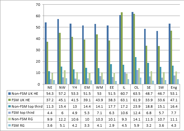
- In regional terms, the FSM progression rate to all UK higher education ranges from 33.6% in the South West to 63.1% in Inner London, a huge 30 percentage point variation. Outer London is only one point behind at 61.9%. Exceptionally, the FSM progression rate in Inner London exceeds the non-FSM progression rate. Elsewhere, the non-FSM rate exceeds the FSM rate by between nine and 17 percentage points.
- FSM progression rates to top third institutions are much lower, ranging from 4.4% (North East) to 12.4% (Outer London), which outscores Inner London at 10.6%. Both are well ahead of the national average at 7.7%. The non-FSM progression rates significantly exceed the FSM-eligible rates in every region. The gap is smallest in Inner London at 6.6 percentage points.
- The gaps in London between FSM-eligible progression rates to all UK HE and the top third institutions reach 50 percentage points, significantly higher than the 39 percentage point national average. The smallest gap is 27 percentage points in the South East. Although London is leading the way on both these measures, its conspicuous success on the less demanding measure throws into sharper relief the limited progress made against the other.
- A similar pattern is revealed when it comes to Russell Group universities, though the differences are more severe. The FSM progression rate ranges from 2.9% in Eastern England to 5.9% in Outer London, with Inner London only very slightly above the national average at 4.5%. Inner London also falls behind the North West on this measure. There are again significant differences between the rates for FSM and non-FSM. This gap is smallest in Inner London at 4.8 percentage points.
- Chart 6, below, compares FSM and non-FSM progression rates by region to all UK higher education, the top third and Russell Group institutions respectively. The data is shown rounded to a single decimal place. This shows that the gaps between Russell Group and top third progression rates for FSM students are far bigger in London than anywhere else – 6.1 percentage points in Inner London and 6.5 percentage points in Outer London compared with a national average of 3.4 percentage points. FSM progression to Russell Group universities seems to be the point at which the celebrated London effect has stalled.
Chart 6: FSM and non-FSM progression by region to all UK HE, ‘top third’ and Russell Group institutions 2011/12
- As far as FSM progression to Oxbridge is concerned, the data is too limited and approximate to tell us anything substantial, other than to confirm that national FSM progression rates are scandalously low. There might have been a slight improvement – we can’t tell for certain – but from a horrifically low base. Five regions sent a maximum of 5 FSM-eligible learners to Oxbridge in 2012 while the other five each managed between 6 and 14.
What limits FSM progression to selective higher education?
Selective universities frequently argue that the main obstacle preventing the admission of more disadvantaged students is that far too few of them achieve the highest attainment levels necessary to secure admission.
Much is made in particular of the comparatively low number of FSM eligible students achieving AAA+ grades at A level – though a PQ reply confirmed (Col 35W) that 546 students achieved this in 2011 and, as we have seen, the data above shows 1,240 FSM students progressing to Russell Group universities in 2012, so well over 50% had lower grades than this. Some courses require slightly lower grades and contexualised admissions practice is almost certainly more widespread than many are prepared to admit.
Unfortunately though, there is very little published data defining excellence gaps – the difference in performance at high attainment levels between advantaged and disadvantaged students – so it is much more difficult than it should be to find hard evidence of this relationship and how it varies by region.
There seems to be broad consensus in the research literature that, although attainment is not the only contributory factor, it is the most significant cause of under-representation, not least because the effect is much more limited when controls for high attainment are introduced.
But it also recognised that a variety of other factors are in play, including:
- Personal, peer and community aspirations
- Motivation and resilience
- Acquisition of social and cultural capital
- Subject choice (often discussed in terms of ‘facilitating subjects’)
- Access to and quality of information, advice and guidance
- Aversion to student debt
- Whether educators demonstrate consistently high expectations and are favourably disposed towards the most selective universities.
Of course it is overly simplistic to regard such factors as distinct from high attainment, since several of them contribute indirectly towards it.
It is also important to bear in mind that the most demanding and highest tariff courses in particular disciplines are not necessarily located at the most prestigious universities, so – even allowing for screening effects – schools and colleges may be acting in many students’ best interests by pointing them in other directions.
And it is open to question whether disadvantaged students should be persuaded to attend higher education institutions that do not suit them personally, even if the future flow of economic benefits suggests this is the most rational decision. There is a trade-off between present happiness and future income and potential students – as adults – should arguably be able to exercise some freedom of choice. There is also the risk of drop-out to consider.
These factors will impact on different students with different intensities in different combinations and in very different ways: there can be no ‘one size fits all’ solution.
All this aside, it seems that – for the disadvantaged student cohort as a whole – the cumulative impact of such factors is much less significant than the impact of attainment.
So it would be a reasonable hypothesis that regions whose FSM (and non-FSM) students are under-represented at Russell Group universities demonstrate relatively lower levels of high attainment at GCSE and A level.
Could this help to explain why Inner London, so successful in terms of progression to UK higher education institutions, is far less so where Russell Group universities are concerned? The remainder of this section struggles to test this hypothesis with the very limited data available.
Taking A level first, Chart 7, below, compares top grade A level performance in 2013, the most recent year for which this data is available, while Chart 8 compares achievement of AAB A level grades or higher in 2011 and 2012 with FSM-eligible and non-FSM progression rates in 2012 drawn from the destinations data. (Note that the 2011 data does not supply separate AAB+ outcomes for Inner and Outer London).
Chart 7: Top A level performance by region 2012/13

Chart 8: Regional achievement of AAB+ grades at A level in 2011 and 2012 compared with 2012 FSM and non-FSM progression rates to RG universities

Chart 7 shows that Inner London returns the lowest rates of top-grade A level attainment, while Outer London is at the top of the range. This suggests that top grade A level attainment is depressed in Inner London, which might well be attributable to the exceptionally high incidence of relatively lower attaining FSM-eligible students.
Chart 8 again shows Outer London performing strongly – on both top grade A level attainment and Russell Group progression, while Inner London is lagging behind.
A straightforward bilateral comparison between Inner and Outer London suggests a clear correlation between these two variables, although correlation does not amount to causation.
Moreover, the picture becomes somewhat more complex when other regions are factored in. Outer London has similar top grade A level attainment to the South East, but performs significantly better on Russell Group progression, even with a significantly higher proportion of FSM students.
Meanwhile Inner London, clearly the laggard in terms of top grade A level performance, is also the backmarker for non-FSM Russell Group progression. However, it still seems to perform comparatively well in terms of FSM progression, especially when compared with the South East.
This could be explainable by the fact that relatively more FSM students in Inner London achieve the highest grades, or perhaps they are disproportionately the beneficiaries of contexualised admissions practice. Other factors could also be in play, not least the geographical proximity of several Russell Group institutions.
There is some evidence – published by the Social Mobility and Child Poverty Commission (SMCPC) and recently taken up in CfBT’s research on the ‘London effect’ – that disadvantaged students across London as a whole are relatively strong performers in higher grade GCSEs.
The SMCPC’s 2013 State of the Nation report (page 191) drew attention to overall London success on an 8+ A*-B GCSE including English and Maths (and excluding equivalents) measure – albeit distinguishing between those attracting Pupil Premium funding and their peers.

This table was converted into a chart in a recent CfBT research report on London.

Unfortunately, we cannot see the data for Inner and Outer London separately, so the ‘London effect’ may be disproportionately attributable to the Outer boroughs.
So where does this leave us?
The balance of probabilities suggests that the incidence of high attainment at GCSE and post-16 will impact strongly on progression to selective higher education and so provide the root cause for regional differences in progression rates.
Regions wishing to improve their performance need to look first at increasing high attainment, taking full account of disparities between the performance of FSM and non-FSM students.
There is some evidence to suggest that the celebrated ‘London effect’ has not translated into achievement of the highest attainment levels at A level in Inner London, especially compared with Outer London. This is impacting negatively on progression rates for FSM students but, ironically, progression rates for non-FSM students seem to be taking a bigger hit, perhaps because they do not benefit so significantly from contexualised admissions.
Any London-wide regional strategy to improve progression to the most selective universities would need to focus strongly on closing the gaps between FSM and non-FSM progression rates in Inner and Outer London respectively.
The policy response to poor FSM progression
The current policy response is multi-faceted but focused primarily on system-wide improvement, rather than organising and targeting support directly at the students most likely to benefit.
This is partly a function of a market-driven political philosophy, fundamental aversion to centrally organised programmes and commitment to a distributed model in which institutions enjoy substantial autonomy, subject to a strong accountability regime which focuses primarily (but not exclusively) on outcomes, including via the introduction of the destination measures discussed in this post.
By strengthening the system as a whole, it is anticipated that standards will rise across the board. A more rigorous national curriculum and more demanding qualifications will raise performance thresholds, ensuring that all learners are better prepared for progression, regardless of their destination. Some examinations are being revised to remove ceilings on the performance of the highest attainers.
Reporting of performance is adjusted to ensure that schools focus on improving attainment and progress of all learners, regardless of their starting point. Inspection includes checks that high attainers are not underachieving.
A series of interventions has been introduced to strengthen attainment and progression in maths and across other STEM subjects.
There have been efforts to strengthen the role of the Office for Fair Access (OFFA) and to introduce a co-ordinated ‘National Strategy for Access and Student Success’ involving collaboration between OFFA and HEFCE. Meanwhile HE student number controls have been relaxed enabling institutions to expand their intakes of suitably qualified students.
Some degree of localised intervention is taking place through the free schools programme as a first tranche of selective 16-19 institutions has been established, often with an explicit mission to increase the flow of disadvantaged students to selective higher education.
Financial support has been targeted towards disadvantaged learners through the Pupil Premium, ensuring that schools receive extra funding for each disadvantaged learner they admit up to and including Year 11. Academies – including many selective schools – are permitted to prioritise admission of these learners when oversubscribed.
There are issues with aspects of this agenda, for example:
- The introduction of universal end of KS2 tests may reduce their capacity to differentiate the performance of the highest attainers, so recently enhanced through the adoption of Level 6 tests. There is an associated risk that schools’ internal assessment systems will impose artificially low ceilings restricting high attainers’ progress.
- Ofsted’s welcome focus on the most able in schools gives insufficient emphasis to those attracting the Pupil Premium and is not backed up by explicit guidance. Nor does it apply to the separate inspection of post-16 settings, undertaken under a different inspection framework.
- OFFA and HEFCE cannot readily alter the behaviour of independent higher education institutions that make too little progress with fair access, or which improve too slowly. There are too few carrots and sticks and widespread resistance to the imposition of robust targets, even though the SMCPC has called for this repeatedly. Efforts at strengthening institutional collaboration are equally constrained.
- As yet there are too few selective 16-19 institutions to make a real difference. They are too little focused on supporting improvements in neighbouring institutions and, even within their own intakes, do not always give sufficient priority to the most disadvantaged students.
- The Pupil Premium stops at age 16 and schools are largely free to use it as they wish – there is no guarantee that each learner attracting the Premium will benefit commensurately and some risk that high attainers are amongst the most vulnerable in this respect.
- One wonders whether the destination indicators, when introduced into the accountability regime in 2016, will be influential enough to change institutional behaviour. The simultaneous deployment of several different measures of selectivity may dilute their impact. On the other hand, a single measure would be too blunt an instrument.
But these are second order issues. Overall, the current education reform programme can be expected to bring about some improvement in FSM progression rates to selective higher education.
However:
- It will take a comparatively long time.
- There is significant deadweight.
- Fault lines between higher education and schools policy remain problematic.
- Nothing is holding these disparate policy elements together, so ensuring that ‘the whole is greater than the sum of the parts’.
Solving the Policy Design Problem
Given the context of wider government policy, what additional policy dimension should be introduced to secure significant improvements in progression rates for disadvantaged learners to selective higher education?
The missing component – which might be introduced nationally or piloted at regional level and subsequently rolled out – is a light touch framework that will supply the essential minimum scaffolding necessary to support effective market operation on the demand and supply sides simultaneously.
This is by no means equivalent to a rigid, centralised top-down programme, but it does recognise that, left to its own devices, the free market will not create the conditions necessary for success. Some limited intervention is essential.
The centrepiece of the framework would be a structured typology or curriculum comprising the full range of knowledge, skills and understanding required by disadvantaged students to equip them for progression to selective higher education
- On the demand side this would enable educational settings to adopt a consistent approach to needs identification across the 11-19 age range. Provision from 11-14 might be open to any disadvantaged learner wishing it to access it, but provision from 14 onwards would depend on continued success against challenging attainment targets.
- On the supply side this would enable the full range of providers – including students’ own educational settings – to adopt a consistent approach to defining which knowledge, skills and understanding their various programmes and services are designed to impart. They would be able to qualify their definitions according to the age, characteristics, selectivity of intended destination and/or geographical location of the students they serve.
With advice from their educational settings, students would periodically identify their learning needs, reviewing the progress they had made towards personal targets and adjusting their priorities accordingly. They would select the programmes and services best matched to their needs.
The supply side would use market intelligence to adjust the range of programmes and services to meet need from different constituencies and localities, acting swiftly to fill gaps in the market and eradicate over-supply. Programmes and services attracting insufficient demand would close down, while popular programmes and services would expand to meet demand. Small providers with many competitors would discuss the benefits of collaboration to achieve economies of scale, so bringing down costs and increasing demand.
Each learner within the programme would have a personal budget dedicated to purchasing programmes and services with a cost attached. This would be fed from several sources including:
- Their annual Pupil Premium allocation (currently £935 per year) up to Year 11.
- A national fund fed by selective higher education institutions. This would collect a fixed minimum topslice from each institution’s outreach budget, supplemented by an annual levy on those failing to meet demanding new fair access targets. (Institutions would also be incentivised to offer programmes and services with no cost attached.)
- Philanthropic support, bursaries, scholarships, sponsorships and in-kind support sourced from business, charities, higher education, independent schools and parents. Economic conditions permitting, the Government might offer to match any income generated from these sources.
This would be a more than adequate replacement for Aim Higher funding, the loss of which is still felt keenly according to this recent DfE research report.
A solution of this kind would be largely self-regulating, requiring only minimal co-ordination and a small administrative budget. It would have several conspicuous advantages in terms of securing much greater coherence and consistency:
- Across the age range, securing continuity and progression for all participating learners throughout secondary education up to the point of entry into higher education.
- Between educational settings, especially at the key transition point between secondary and tertiary education at age 16, when half or more students might be expected to move to a different setting.
- Regardless of geographical location, so that students are less disadvantaged by virtue of where they live, able to draw on high quality blended and online provision in locations where face-to-face provision is unviable.
- Incorporating the contribution of national, regional and local centres of excellence – including for example new selective 16-19 institutions such as the London Academy for Excellence and the Harris Westminster Sixth Form – providing them with a platform to share and spread excellent practice and supply outreach of their own.
- Providing a nexus for cross-sectoral partnership and collaboration, including collaborative efforts in the higher education sector recently launched by OFFA and HEFCE.
- Supplying a context in which selective higher education institutions can be more transparent about their contextual admission offers and other fair access policies, enabling students to make proper comparisons when selecting their preferred institutions.
- Accommodating and complementing the reform package I have already proposed to improve fair access to Oxbridge.
The first of these dimensions is particularly important given recent research, published by the Social Mobility and Child Poverty Commission which finds that:
‘Of 7,853 children from the most deprived homes who achieve level 5 in English and maths at age 11 (8.5%…), only 906 (11.5%) make it to an elite university. If they had the same trajectory as a child from one of the least deprived families, then 3,066 of these children would be likely to go to an elite university (39.0%) – suggesting that 2,160 children are falling behind.’
The report concludes:
‘Poorer students have lower average achievement at each stage of their education and even those who start strongly with higher achievement at Key Stages 1 and 2 are more likely to fall off their high achievement trajectory than their wealthier peers. The achievement of students from poorer backgrounds is particularly likely to fall away between Key Stage 2 and Key Stage 4, making secondary school a potentially important area of intervention for policymakers interested in increasing participation at high-status universities amongst young people from more deprived backgrounds.’
Such an approach would be relatively inexpensive and fully scalable (I have not properly costed it, but a £50m topslice from the annual £2.5bn national Pupil Premium budget – for which there is precedent – would be more than enough to meet the full burden on the taxpayer.)
A regional pilot – perhaps in London, or perhaps elsewhere – would accommodate an EEF-funded randomised control trial, though this would need to be extended if incorporating a cohort undertaking the full cycle from Year 7 upwards.
The full benefits would not be realised until this first seven year cycle was completed, but one would anticipate significant positive impacts on attainment much sooner than that and, if students were allowed to participate from Year 10, or possibly even later, the impact on progression to selective universities would be felt within the lifetime of the next government.
Conclusion
There are strong equity and social mobility arguments for improving significantly the attainment of disadvantaged students and increasing their rates of progression to selective universities. This is also a sound investment in human capital, improving our national standing in the ‘global race’.
These progression rates have been stalled for a generation. Recent attempts to claim ‘green shoots of recovery’ relate only to the least selective top third measure. Even if they are realised, they are unlikely to wash through to Russell Group and Oxbridge admissions where the under-representation of FSM students is marked and, some would argue, a national scandal.
The publication of Destination Measures provides a valuable addition to our evidence base, though we know far too little about excellence gaps – between the performance of advantaged and disadvantaged learners on high attainment measures – so cannot readily explore the impact of these on progression rates.
Current education policy will likely bring about improvements, but only very slowly. Progression rates to the most selective institutions will be the hardest and slowest to shift. There are ongoing risks associated with cross-policy coherence and the fault lines between education policy for schools and higher education respectively (with the post-16 sector caught somewhere in between).
An additional policy strand is needed to secure vertical, horizontal and lateral coherence and deliver a whole greater than the sum of its parts. Potential design principles for this strand are set out above. Substantial benefits would be realised during the lifetime of the next government.
Perfect Manifesto material!
GP
July 2014
